seaborn
インストール
$ pip install seaborn
最初にインポートするライブラリや設定
import seaborn as sns
import matplotlib
# matplotlib.use('agg') # python scriptのときは有効化する
import matplotlib.pyplot as plt
import matplotlib.dates as mdates # time seriesの描画
import importlib
if importlib.util.find_spec("japanize_matplotlib"):
    import japanize_matplotlib
else:
    # 日本語フォントが入っていないなど/
    import os
    os.system("pip install japanize-matplotlib")
    import japanize_matplotlib
%config InlineBackend.print_figure_kwargs={'facecolor' : "w"} # matplot, seabornが生成するpngが透明にならないようにする
描画
jupyterのセルにplt.show()を最後にするかaxインスタンスを最後に置くかの二通りがある
plt.figure(...)
...
plt.show()
or
ax = sns.some_func(...)
...
ax
more resolution graph
plt.figure(figsize=(15, 15)) # ここを大きくする
ax = sns.scatterplot(data=hoo, x=bar, y=hoge)
ax
より見やすくする
seabornには幾つかテーマセットがあり、文字が大きく太いテーマとしてposterがある
sns.set_context("poster")
distplot(重ね合わせ、滑らかなヒストグラム)を描画する
- 現在、
distplotは非推奨であるため、displotを使用することを推奨
ax0 = sns.distplot(a["{ANY_VALUE}"], kde=False, bins=[x for x in range(0, 1800, 10)], hist_kws=dict(alpha=0.5))
ax0.set(xlim=(0, 1800))
ax1 = sns.distplot(a["{SOME_VALUE}"], kde=False, bins=[x for x in range(0, 1800, 10)], hist_kws=dict(alpha=0.5))
ax1.set(xlim=(0, 1800))
bins=[x for x in range(...)]はヒストグラムのステップを決定するものbins=100で100個のbinで分割するなど数値の引数も取ることができるhist_kwsは半透明描画等の描画オプジョンkde=Falseはkdeでフィット曲線を描画しないオプションnorm_hist=Trueは値をノーマライズするかhist_kws=dict(cumulative=True)は累積ヒストグラム
histplot(バータイプのヒストグラム)を描画する
scatter(散布図)を描画する
ax = sns.scatterplot(x="{PANDAS_COL_NAME0}", y="{PANDAS_COL_NAME1}", hue="{ANY_CATEGORY_AXIS}", data=data: pd.DataFrame, s={DOT_SIZE}: int)
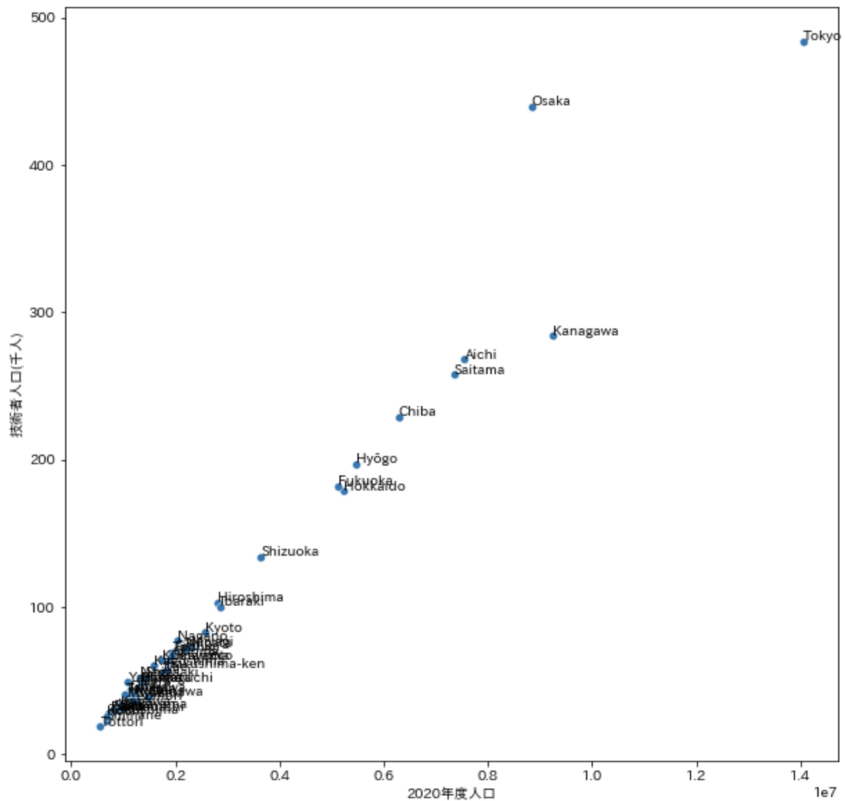
scatter(散布図)にアノテーションを追加する
plt.figure(figsize=(10, 10))
ax = sns.scatterplot(data=df, x="2020年度人口", y="技術者人口(千人)")
# Annotate label points
for text, x, y in zip(df["country_subdivision"], df["2020年度人口"], df["技術者人口(千人)"]):
    ax.annotate(text, (x+0.7, y+0.5)) # 0.7, 0.5は文字を右上に表示するためのパラメータ
ax
barplotを描画する
ax = sns.barplot(x="{PANDAS_COL_NAME0}", y="{PANDAS_COL_NAME1}", hue="{ANY_CATEGORY_AXIS}", data=data: pd.DataFrame, s={DOT_SIZE}: int)
lineplotを描画する
円グラフを描画する
colors = sns.color_palette('Paired')
fig, ax = plt.subplots(figsize=(5,5))
explode = (0, 0.1)
ax.pie(df['category'].value_counts(), explode=explode, labels=df['category'].value_counts().index,
       autopct='%1.1f%%', shadow=True, startangle=90, colors=colors)
ax.axis('equal')
ax
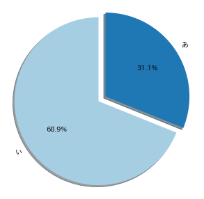
- カテゴリ数をカウントして円グラフにする例
- 円グラフ-exapmple
heatmapを描画する
time seriesの軸を描画する
matplotlib.datesをインポートした上でx軸の粒度とフォーマットを定義する
例えば、以下の例は月ごとに表示する
plt.figure(figsize=(15, 15))
plt.xticks(rotation=90)
ax = sns.lineplot(x ="date", y = "num", hue="tag", data =b)
ax.xaxis.set_major_locator(mdates.MonthLocator())
ax.xaxis.set_major_formatter(mdates.DateFormatter('%Y-%m'))
ラベルのテキストを強制的にフォーマットする
float値などが適切なフォーマットになってくれないことがある
描画オブジェクト取得後に、テキストを取り出し加工することで上書きすることができる
ax.set_yticklabels([ f"{float(l.get_text()):0.02f}" for l in ax.get_yticklabels()])
ax.set_xticklabels([ f"{float(l.get_text()):0.02f}" for l in ax.get_xticklabels()])
save to png file
ax.get_figure().savefig("{OUTPUT}.png")
output image size definition
plt.subplots(figsize=(10,9))
add title, xtitle, ytitle
# 一括で設定
ax.set(title="{TITLE}", xlabel="{X_LABEL}", ylabel="{Y_LABEL}")

# 個別に設定(フォントサイズも指定可能)
ax.set_title("{TITLE}", fontsize=20)
tickの設定
ax.set(xlim=(0, 20), xticks=np.arange(0, 20, 0.25), title="title", xlabel="xlabel", ylabel="ylabel")
ax.set_xticklabels(ax.get_xticklabels(), rotation=90)
中央値、平均値を表示する
# 平均値
ax.axvline(data["rate"].mean(), color='r', linestyle='--', linewidth=2)
# 中央値
ax.axvline(data["rate"].median(), color='b', linestyle='-', linewidth=2)
add limit
# this is example
ax.set(xlim=(0, 180), ylim=(0.2, 0.60))
xlabelが表示されないとき
明示的にset_xticklabelsする
ax.set_xticklabels(df.x_label_series_data)
rotate xlabel
ax.set_xticklabels(ax.get_xticklabels(), rotation=90)
上記で期待通りに動作しない時以下の設定でrotateできる
plt.xticks(rotation=90)
en-smoll xlabel
ax.set_xticklabels(ax.get_xticklabels(), fontsize=5)
down sampling xlables
for idx, lbl in enumerate(ax.get_xticklabels()):
    if (idx+4)%7 == 0:
        lbl.set_visible(True)
    else:
        lbl.set_visible(False)
clr graphs
ax.get_figure().clf()
multiple graphs
g = sns.FacetGrid(a, col="{MULTIPLE_KEY_COLUMN_NAME}", col_wrap=2, height=5)
g.map(sns.scatterplot, "{X_AXIS}", "{Y_AXIS}", alpha=0.8)
# set here ylim, xlim
# for ax in g.axes.flat:
#    ax.set_ylim(0, 15)
g.add_legend()
g.savefig("{IMAGE}.png")
複数のグラフを表示するとき
Google Colab
トラブルシューティング
japanize_matplotlibが適応されない
- 原因
sns.set~関数を呼び出すと日本語フォントがリセットされる
- 対策
sns.set~を用いない